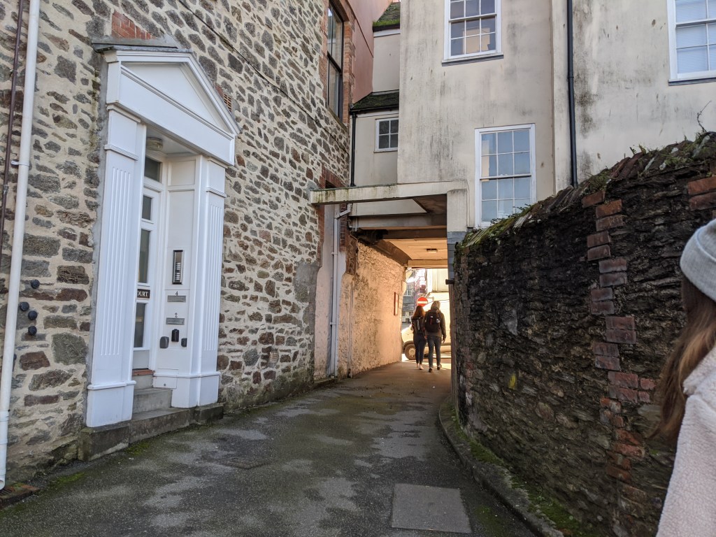
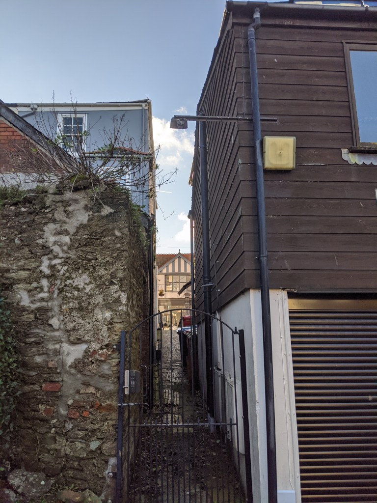
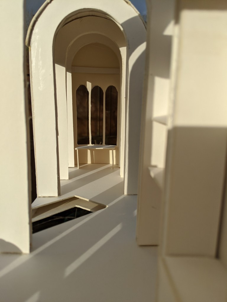
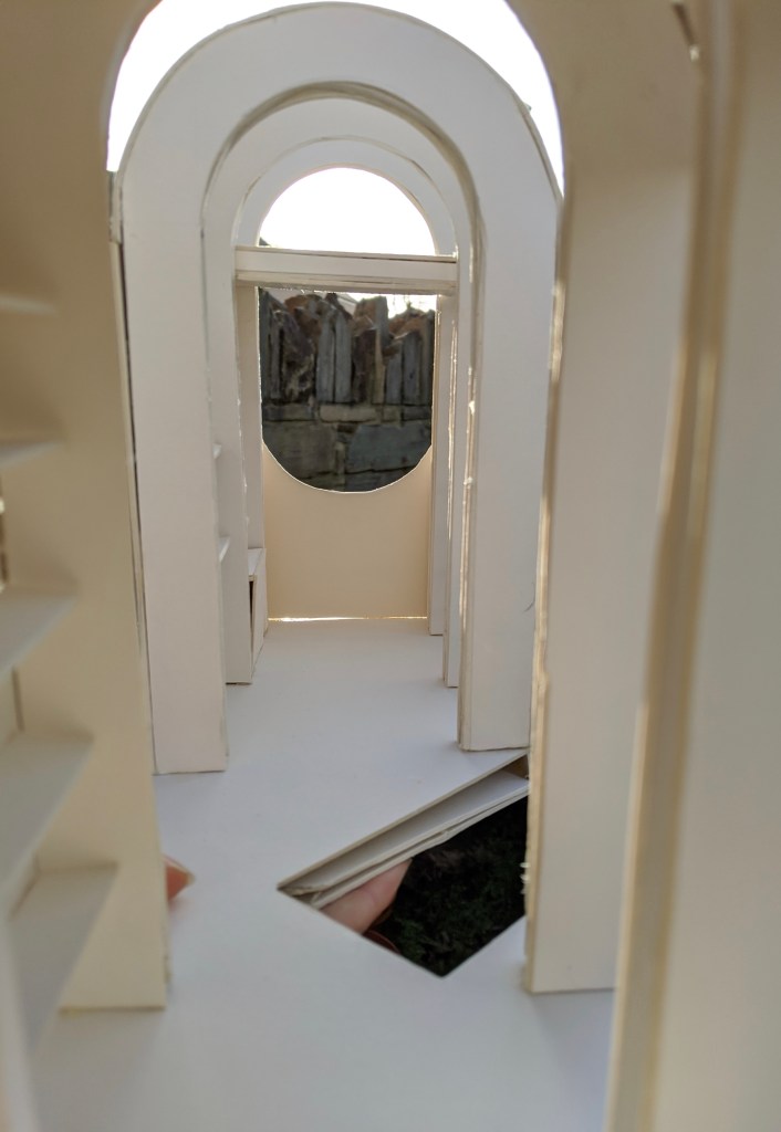
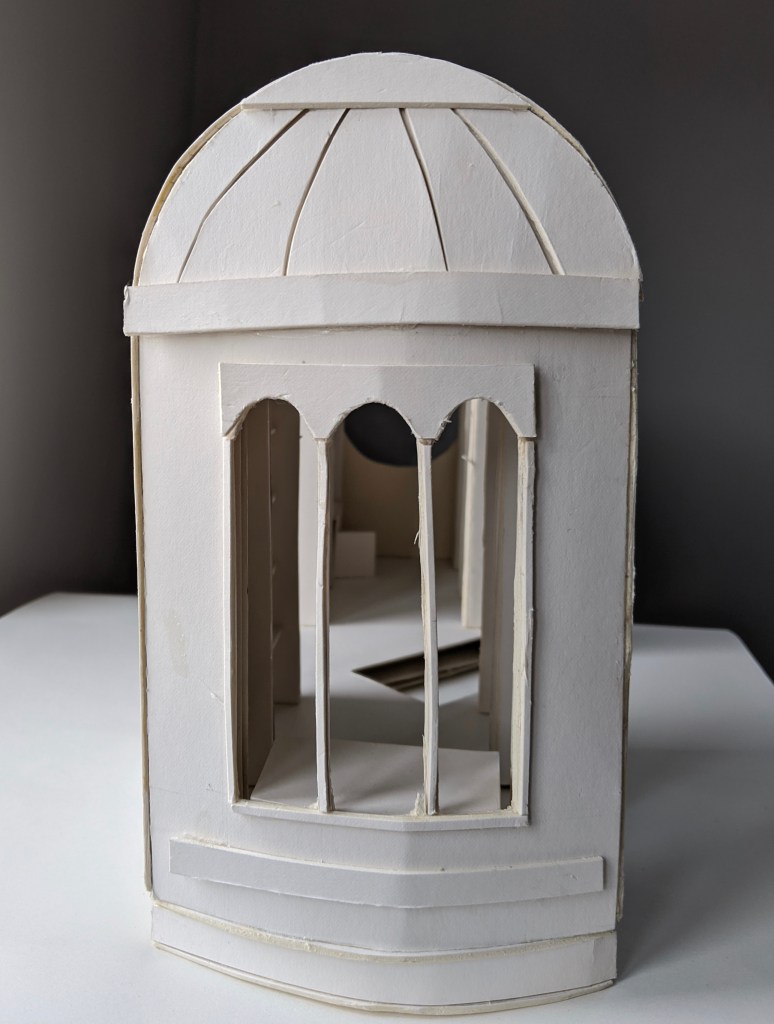
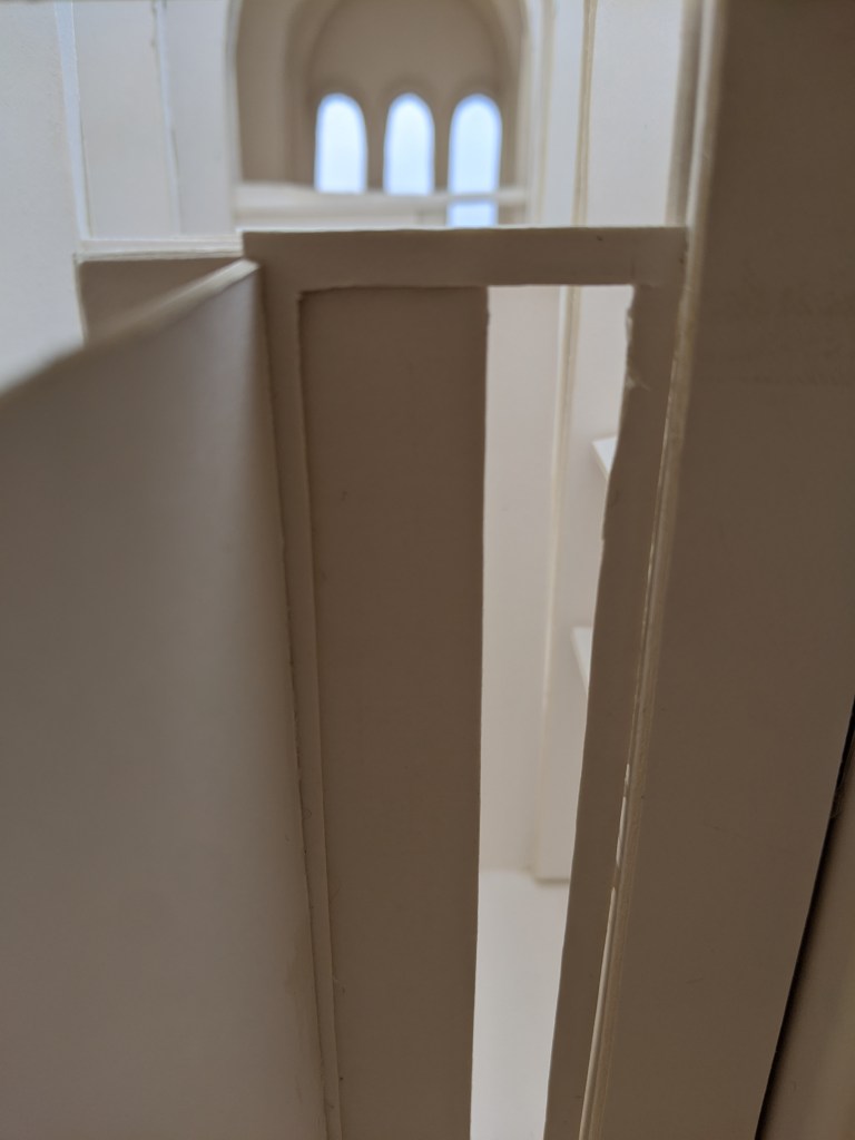
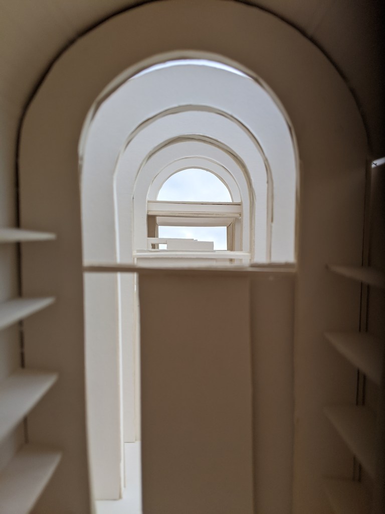
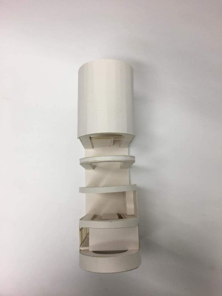
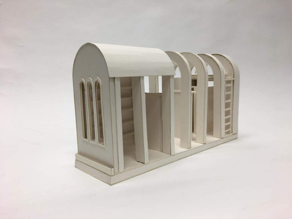
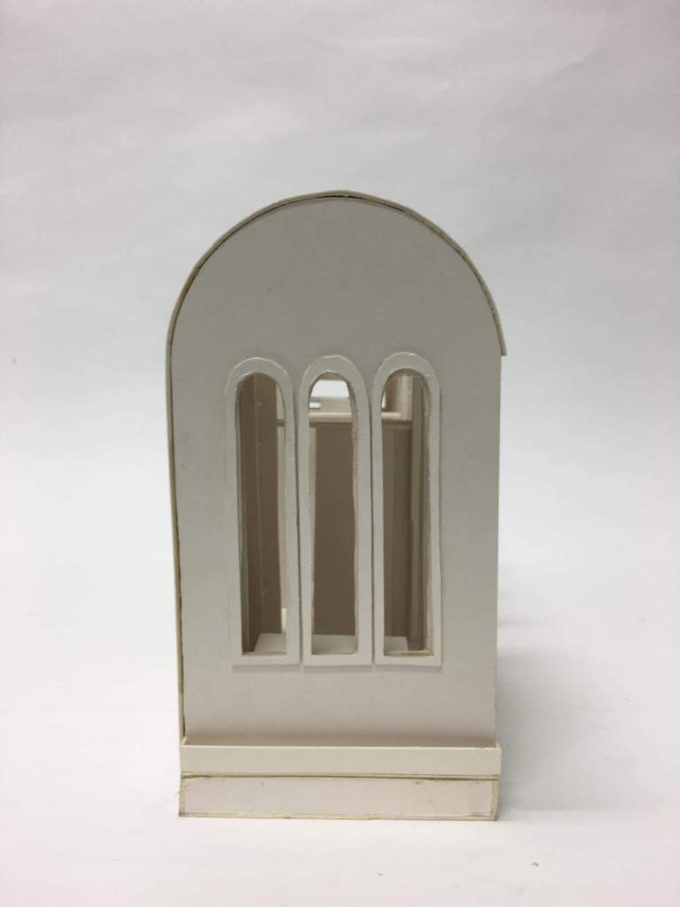
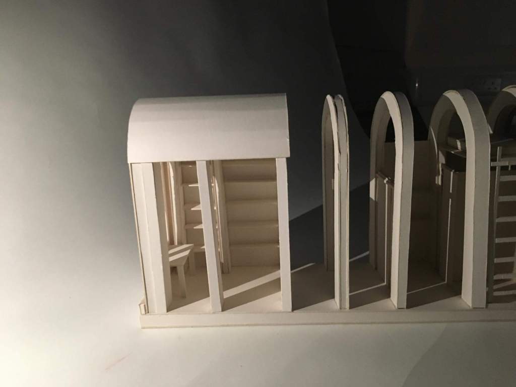
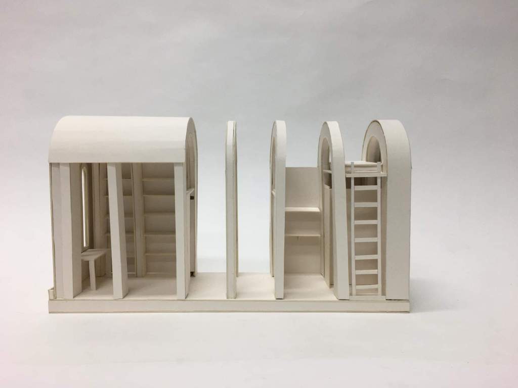
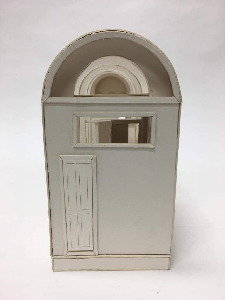
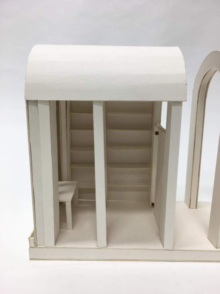
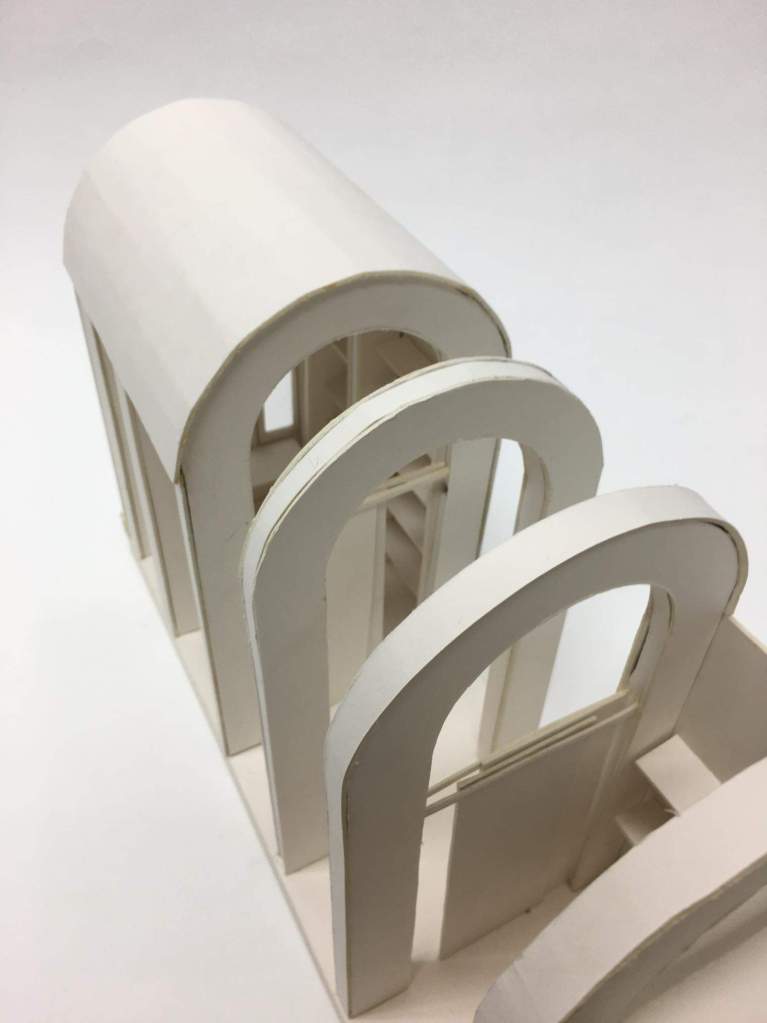
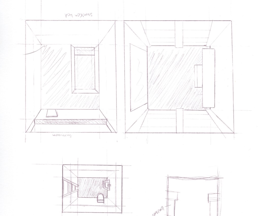
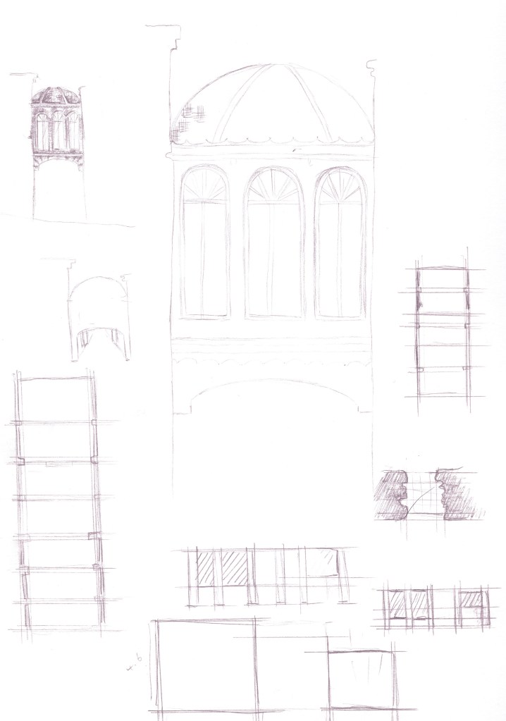
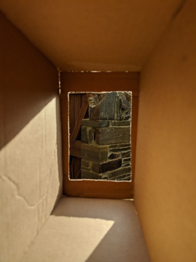
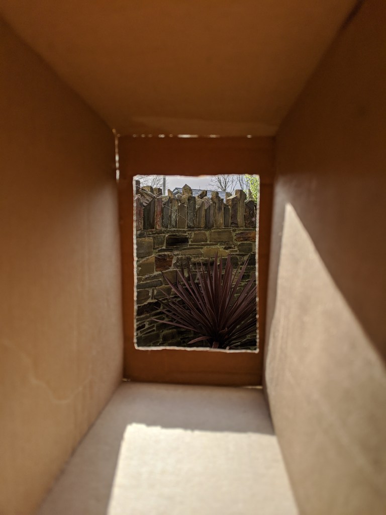
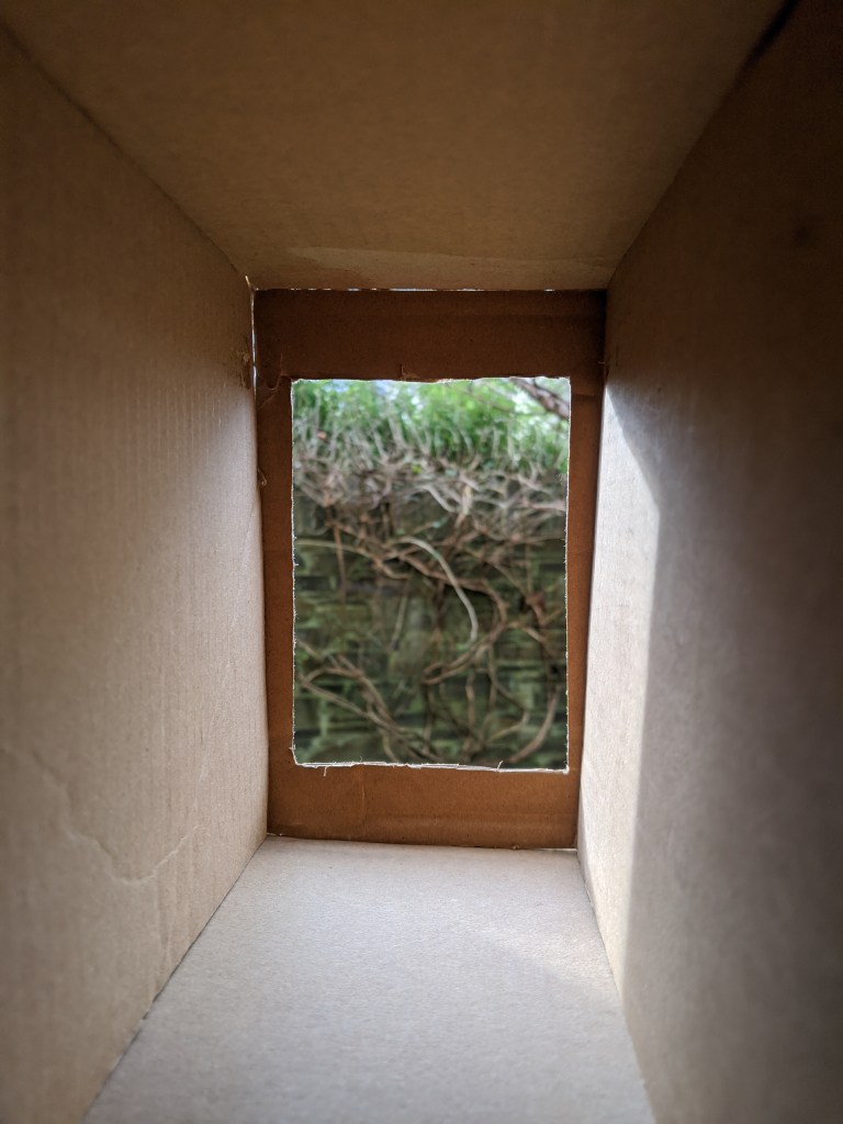
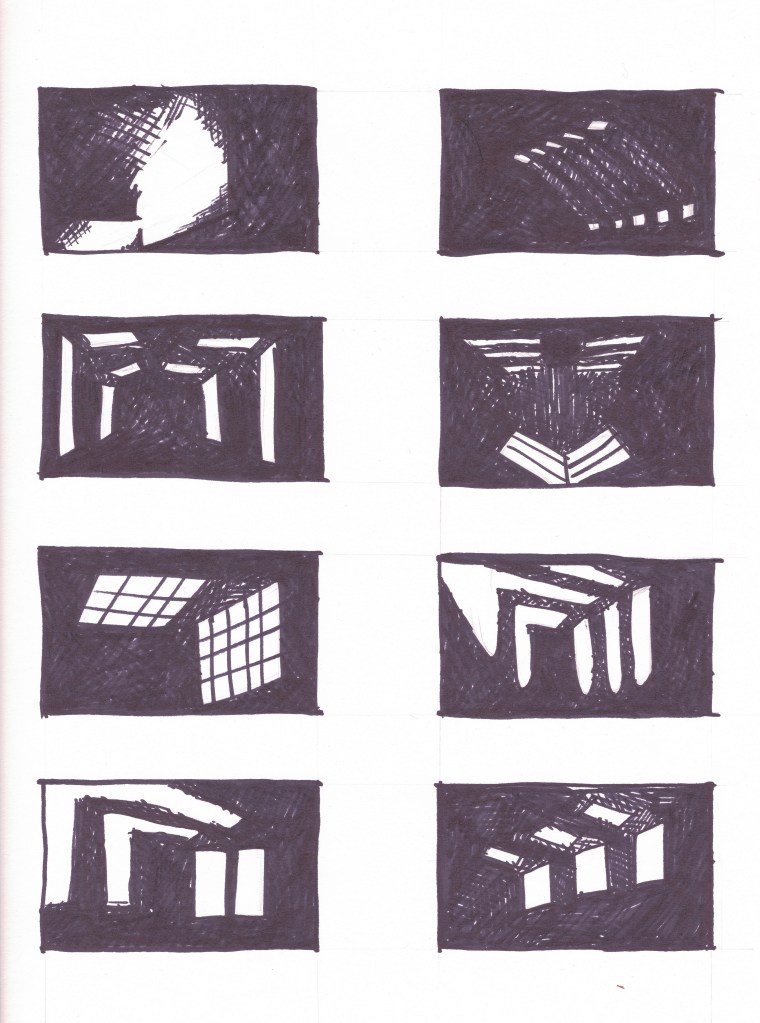
Blog Feed

THE BEGINNING

THE SITE

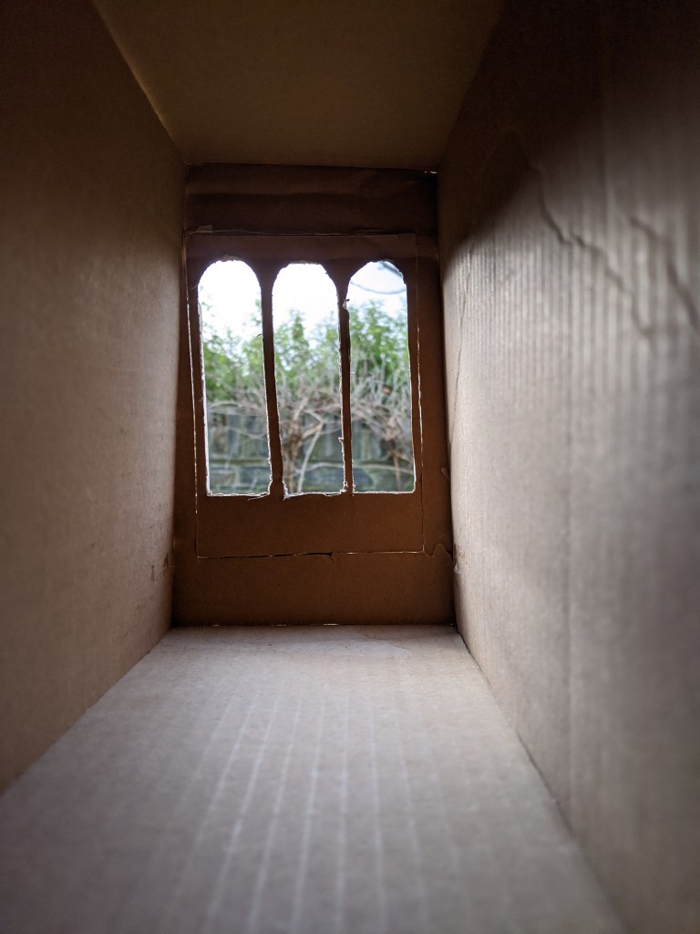
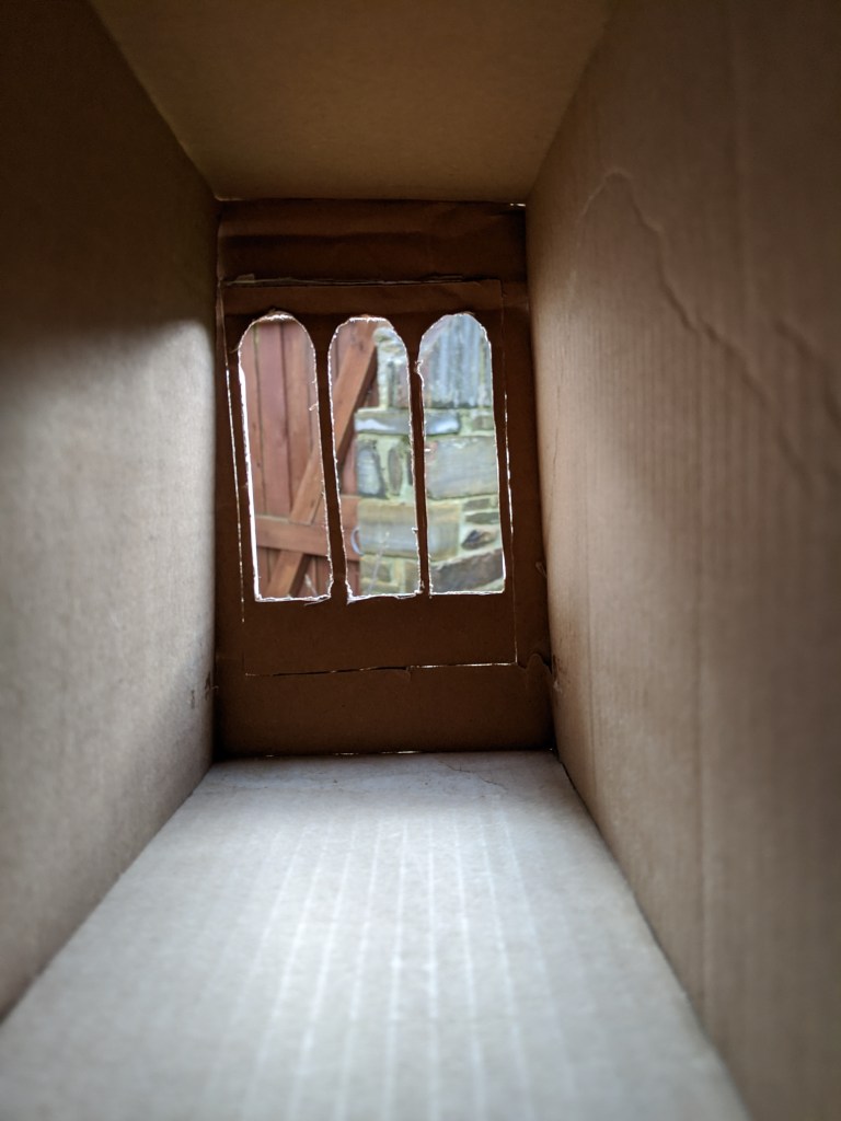
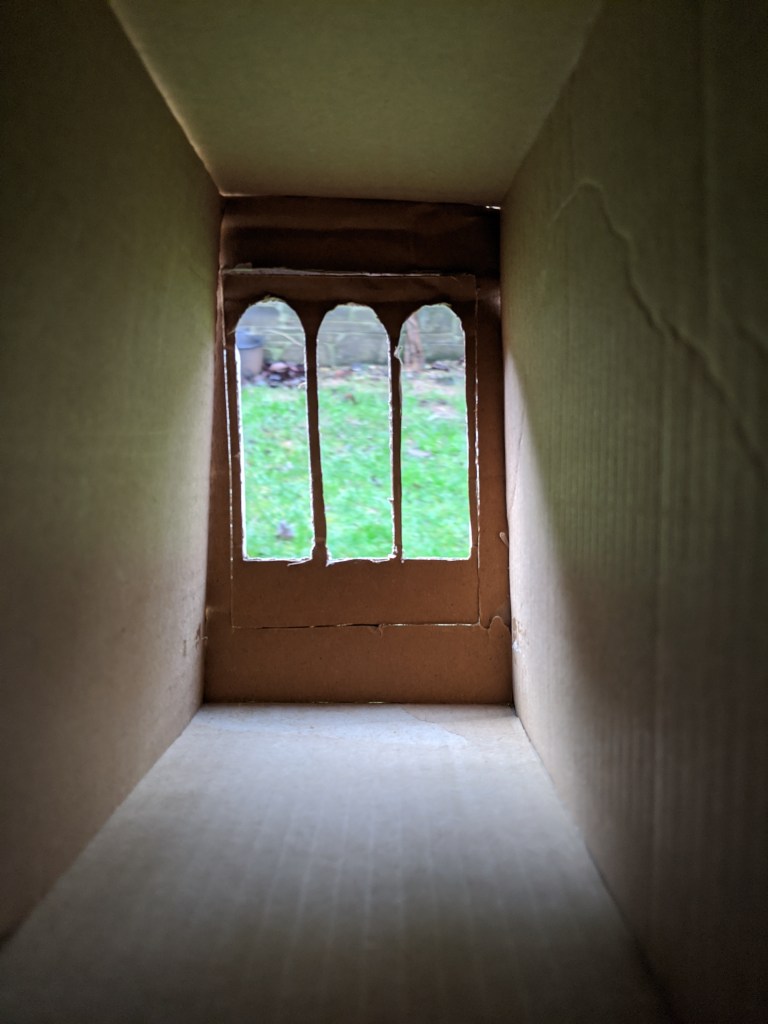
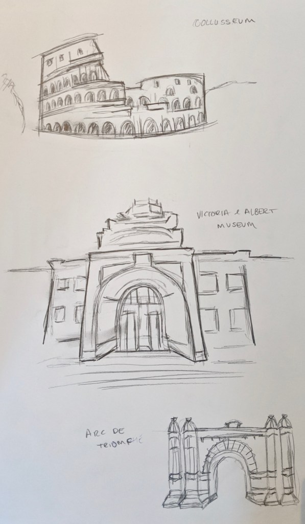
Today we went and looked at the site where the building we are designing would be placed. We did a few continuous line drawings to get a feel for the surrounding buildings. It encouraged me to start thinking about how I wanted it to respond to its surroundings while investigating the light aspect, a main focus of the project. It was good to see where the sunlight was coming from at that time of day. I also found it useful to get a feel for the natural and unnatural occurring shapes around the site as this can be a good reference point when designing.

Featured post

REFLECTING

SELF ASSESSMENT

I find it important to look back and reflect one the module as a whole, this allows me to critically assess how well I worked and pinpoint problem areas I have so I can work on them. Something in particular that I found very difficult was staircases. I experimented in my sketchbook with the idea of a straight staircase, a spiral staircase and then I eventually settled on a curved staircase. However it wasn’t and still isn’t clear to me exactly the spiral and curved are represented in a section it has been something I struggled with and needed to seek more help on as this effected my drawings and model. Making the model has made me aware of how difficult arches are to do accurately when not knowing the correct tools to use for the job. This is something I can improve upon next time.

CHANGES

MODEL ALTERATIONS

As I mentioned on my previous post the next stage for me was rectifying the issues that were evident within my model that I presented with. Firstly I looked at the front elevation which I decided to make curve outwards and I added some simple embellishments to give it more shape and portray a more realistic idea of what it would look like if built. The second part proved more difficult as I wanted to take away all of the doors, I began by returning to my original plan of having the staircase come up in the centre of the two structures, this eliminating the door at the back and the disjointed entrance. I then researched a lot into tiny houses and their solutions to bathrooms. Something interesting I came across is pictured below, it is a toilet that actually folds away into a cupboard. I decided to incorporate this idea into my design as then I wouldn’t need a permanent wall to hide its structure. I then experimented with the idea of having a concertina fold down wall, as commonly used inn business buildings as a partition. I did however find this very difficult to model, but it is still my concept for the design.

FINAL REVIEW

MODEL

I completed the model for our final review presentation and took photos of it inside and out with harsh light sources and natural light. These were very useful in assessing the design, its language and how resolved it was. After presenting for the module I then showed the lecturer my model within the 1:20 scale site. After this I was provided with feedback upon the design, many if not all of which I completely agreed with. We discussed how it was a shame that you couldn’t see the effect of the repetitive form as I had closed off a section for the bathroom and had put in sliding doors to separate the spaces. This was an issue I hadn’t managed to successfully resolve throughout the process and something I knew I wanted to change. Another key point we discussed was how flat the front elevation looked. I had experimented with different adornments in my sketchbook but had left the model plain, which I agree did look very flat. I am going to look at these key points and hopefully come to a more resolved conclusion.

INTERIOR

FUNCTIONAL/ AESTHETIC

I began exploring how the inside of the building would work as I didn’t want to compromise the aesthetic with the functional things that needed to be included. I looked at hiding the everyday needs such as the toilet and the shower within the floor, so that it would be hidden away until use. However I added this into my model and I did not like how it took a lot of height away from the building. I then looked at things such as doorways and ceilings. I tried to use these to contrast the two separate spaces more, I looked at large glass sliding doors to separate them and glass ceilings. I also researched what the minimum size for a bathroom is so I could use the smallest amount of space for it. I found looking at tiny homes to be particularly useful.

FINAL IDEA

PROCESS

I decided on a final shape for my building and drew it in plan. It was basically the same design as my first iteration with a few minor changes to the roofing and walls on the back section. Because of this I decided to do a quick plan in 1:20 scale as I had already drawn it in 1:50 in my sketchbook previously in plan, section and elevation. I then started to work on my model as it was the beginning of the final week of the module.

LIGHTING STUDY

MODEL

To further explore the way lighting would enter the building and to discover what atmosphere it would create within I made a model. I started with a simple square model roughly the size of the site. I first cut a large rectangular hole at the front of the building and took photos both in daylight and at night with an artificial light source to see the different effects it would give. As instructed I photographed what inside the building would look like at 9am, 12 noon and 3pm in November. I also took more pictures of further times throughout the day to really explore this further. I then did the same for the triple window design that I liked most from my previous drawing experiment and did the same lighting tests.

DESIGN ITERATIONS

TWO MAIN DESIGNS

I took my favourite idea and played around with it further looking at how it would appear visually.I wanted to replicate what the inside of a library would look like for the writing area. My first design was made up of two sections with the same language of arches. However when I modelled this I was not thrilled with the way it worked, I felt the living and writing space needed a greater distinction. I then experimented in drawings with this idea and kept the main writing part the same and completely overhauled the back living section. In discussion in our one to ones we decided this wasn’t as effective as the original design as it felt disjointed.

ARCHES IN ARCHITECTURE

SKETCHES

As the main focus of my building is arches I decided to do some simple quick sketches of historical buildings. I chose to look at the Colosseum, The Victoria and Albert museum and the Arc de Triomphe. It gave me more of a sense of flow of how arches work in buildings and made me want to make sure mine had the same effect.

A PLACE OF MY OWN

READING

We were given a reading by our lecturer called A Place of My Own. It was about a writer who commissioned an architect to create the writers cabin of his dreams. It was not intended as a guide on how to construct a building but more of a way to explore the process. I found it very interesting as there were many lovely points within it. One particular one that stuck out for me was when Charlie was speaking about vine covered windows he said “That’s a great solution for a place where you want light but the view really stinks. The vines filter the sunlight nicely, too, since the leaves are always moving” Pollan, Michael. 1997. A Place of My Own.. It encouraged my imagination to think about different ways light could be filtered and how effects it created could differ.

LIGHT

WINDOWS AND LIGHT SOURCES

I started to explore different ways that light could enter the building. I did this first by drawing different window openings in section. In all of them I opted for a high ceiling as this is such a slim building I wanted to create the feeling of space through height. I looked at which windows looked aesthetically pleasing that would also give an interesting light effect throughout the day. Below are some drawings of windows and of differing lighting effects.

Blog at WordPress.com.

Up ↑

Design a site like this with WordPress.com
Get started